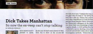
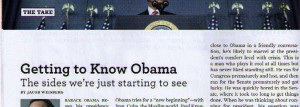
 The latest Newsweek just arrived by snail mail, and I have to say I’m lovin’ the new design. Bigger, bolder photographs… a more elegant (and yet readable!) typeface… informative fun with graphics in the “Back Story,” which Editor Jon Meacham describes as “a visual dissection or explanation of an important issue or phenomenon that will satisfy one’s curiosity or pique interest.”
The redesign is part of a broader effort to find a business model for print journalism that works. The existing model is in deep trouble, especially with regard to newspapers. The mighty New York Times saw fit to pay $1.1 billion in 1993 for the Boston Globe.  But now the entire company — which in addition to those two major dailies includes more than a dozen other U.S. dailies, the International Herald Tribune and a bunch of other stuff like Fenway Park and the Red Sox — the whole company is worth less than $1 billion, and in recent weeks resorted to threatening to shut down the Globe to win union concessions.
Meacham essentially says that Newsweek is getting out of the business of trying to break news. They’re going to take advantage of the relatively contemplative pace of their weekly publication to pursue “the reported narrative” and “the argued essay.”
What is displaced by these categories? The chief casualty is the straightforward news piece and news written with a few (hard-won, to be sure) new details that does not move us significantly past what we already know. Will we cover breaking news? Yes, we will, but with a rigorous standard in mind: Are we truly adding to the conversation? When violence erupts in the Middle East, are we saying something original about it? Are our photographs and design values exceptional? If the answers are yes, then we are in business.
Print publications that survive will be the ones that find a way to exploit the benefits of the printed medium. Now and forever, timeliness is going to favor the Internet. But the web just can’t provide the kind of visual feast that a well-designed magazine can. The inaugural episode of the aforementioned “Back Story” feature, for example, graphically shows 15 purchases that could all be made with the Obama Administration’s $3.5 trillion 2010 federal budget, starting with “everything produced in Italy in 2008” and ending with an overpriced $8.50 burrito in Manhattan.
 It’s fun, it’s evocative, it makes a powerful point about federal spending. But you’re going to have to buy the current Newsweek or squint at the little scanned image at left — I can’t link to Back Story because it’s not online. An intricate, full-page graphic just can’t work online in the same quick-read kind of way as it works in print.
The print version also makes use of photography in a way that is more difficult online. Full-page and two-page photos come to life on paper, but photos that large online would load slowly and expose the inherent visual limitations of the web.
For reasons not clear to me, they passed up an opportunity to repurpose at least some of their photos for the web. The two graphics at the top of the column both click through to the web versions of the respective columns… but on the web, you won’t see the extremely horizontal photographs captured in the screen grabs above. That kind of extreme horizontal actually does work well on the web.
 And here is where I finally get to the REAL point of this post. J’accuse, Newsweek — I know the source of the inspiration for the extreme horizontals. The lovely Web Goddess posted the updated St. George’s Episcopal Church website more than a week ago — don’t tell me that’s not where you got the idea!
That’s right, this homage to Newsweek is actually an excuse to wander back into the Maplewood BlogolopolisTM and show off my wife’s handiwork.
 The Web Goddess created St. George’s website with a handful of pages in March 2001, and has continuously enlarged and improved it ever since. It’s by far the largest church website in the Diocese of Newark, all created by one volunteer who taught herself HTML, CSS and Javascript.
In the process, the Web Goddess amassed a trove of literally thousands of photographs of St. George’s events. Some were taken by other parishioners, but many of them (including the three you see here) she took herself, with the cameras her loving husband bought her.
 In recent months she felt the existing design was starting to look tired, and she wanted to expand her web skills. So she recoded the entire site from the ground up to improve performance and make use of all those wonderful pictures. Each of the three screen grabs here links to a different section of the website, and on any page of the site you can scroll through photos with the arrows at the top of the header. All of this she accomplished outside of working hours while working full-time. (Did I mention I’m proud of her?)
So, nice job, Newsweek — but the Web Goddess was out with her redesign first.
(Regarding the horizontal photos, in the interests of full disclosure, the Web Goddess tips her hat to the website of St. Olaf College.)

Newsweek is a biased rag that’s been taken to disaster by it’s left wing editor. The fact that they raised their price, redid their magazine, and now are going after a wealthier, smaller base shows that.
Pingback: AOL to Acquire Maplewood. Sort Of. :All That Is Necessary…